
目次
はじめに
今回はNext.jsでマテリアルUIの環境構築をする手順について説明します。
基本公式通りです。
あわせて読みたい


MUI: The React component library you always wanted
MUI provides a simple, customizable, and accessible library of React components. Follow your own design system, or start with Material Design.
実装
create-next-appでプロジェクトを作成する
yarn create next-app --typescript my-app
cd my-app
yarn dev
上記のコマンドでプロジェクトを作成しましょう。
いろいろ聞かれますが、全てEnterで進んでください。
マテリアルUIと必要なライブラリをインストール
package.jsonのある階層で以下のコマンドを叩きます。
yarn add @mui/material @emotion/react @emotion/styledこれでインストール完了です。
ボタンを表示させてみる
import Image from 'next/image'
import { Inter } from 'next/font/google'
+ import Button from '@mui/material/Button'

const inter = Inter({ subsets: ['latin'] })

export default function Home() {
  return (
+    <Button sx={{ m: 5 }} variant="outlined">Hello World</Button>
-    <main className="flex min-h-screen flex-col items-center justify-between p-24">
-      <div className="z-10 w-full max-w-5xl items-center justify-between font-mono text-sm lg:flex">
-        <p className="fixed left-0 top-0 flex w-full justify-center border-b border-gray-300 bg-gradient-to-b from-zinc-200 pb-6 pt-8 backdrop-blur-2xl dark:border-neutral-800 dark:bg-zinc-800/30 dark:from-inherit lg:static lg:w-auto  lg:rounded-xl lg:border lg:bg-gray-200 lg:p-4 lg:dark:bg-zinc-800/30">
-          Get started by editing
-          <code className="font-mono font-bold">pages/index.tsx</code>
-        </p>
-        <div className="fixed bottom-0 left-0 flex h-48 w-full items-end justify-center bg-gradient-to-t from-white via-white dark:from-black dark:via-black lg:static lg:h-auto lg:w-auto lg:bg-none">
-          <a
-            className="pointer-events-none flex place-items-center gap-2 p-8 lg:pointer-events-auto lg:p-0"
-            href="https://vercel.com?utm_source=create-next-app&utm_medium=default-template-tw&utm_campaign=create-next-app"
-            target="_blank"
-            rel="noopener noreferrer"
-          >
-            By{' '}
-            <Image
-              src="/vercel.svg"
-              alt="Vercel Logo"
-              className="dark:invert"
-              width={100}
-              height={24}
-              priority
-            />
-          </a>
-        </div>
-      </div>
-
-      <div className="relative flex place-items-center before:absolute before:h-[300px] before:w-[480px] before:-translate-x-1/2 before:rounded-full before:bg-gradient-radial before:from-white before:to-transparent before:blur-2xl before:content-[''] after:absolute after:-z-20 after:h-[180px] after:w-[240px] after:translate-x-1/3 after:bg-gradient-conic after:from-sky-200 after:via-blue-200 after:blur-2xl after:content-[''] before:dark:bg-gradient-to-br before:dark:from-transparent before:dark:to-blue-700/10 after:dark:from-sky-900 after:dark:via-[#0141ff]/40 before:lg:h-[360px]">
-        <Image
-          className="relative dark:drop-shadow-[0_0_0.3rem_#ffffff70] dark:invert"
-          src="/next.svg"
-          alt="Next.js Logo"
-          width={180}
-          height={37}
-          priority
-        />
-      </div>
-
-      <div className="mb-32 grid text-center lg:mb-0 lg:grid-cols-4 lg:text-left">
-        <a
-          href="https://nextjs.org/docs?utm_source=create-next-app&utm_medium=default-template-tw&utm_campaign=create-next-app"
-          className="group rounded-lg border border-transparent px-5 py-4 transition-colors hover:border-gray-300 hover:bg-gray-100 hover:dark:border-neutral-700 hover:dark:bg-neutral-800/30"
-          target="_blank"
-          rel="noopener noreferrer"
-        >
-          <h2 className={`${inter.className} mb-3 text-2xl font-semibold`}>
-            Docs{' '}
-            <span className="inline-block transition-transform group-hover:translate-x-1 motion-reduce:transform-none">
-              ->
-            </span>
-          </h2>
-          <p
-            className={`${inter.className} m-0 max-w-[30ch] text-sm opacity-50`}
-          >
-            Find in-depth information about Next.js features and API.
-          </p>
-        </a>
-
-        <a
-          href="https://nextjs.org/learn?utm_source=create-next-app&utm_medium=default-template-tw&utm_campaign=create-next-app"
-          className="group rounded-lg border border-transparent px-5 py-4 transition-colors hover:border-gray-300 hover:bg-gray-100 hover:dark:border-neutral-700 hover:dark:bg-neutral-800/30"
-          target="_blank"
-          rel="noopener noreferrer"
-        >
-          <h2 className={`${inter.className} mb-3 text-2xl font-semibold`}>
-            Learn{' '}
-            <span className="inline-block transition-transform group-hover:translate-x-1 motion-reduce:transform-none">
-              ->
-            </span>
-          </h2>
-          <p
-            className={`${inter.className} m-0 max-w-[30ch] text-sm opacity-50`}
-          >
-            Learn about Next.js in an interactive course with quizzes!
-          </p>
-        </a>
-
-        <a
-          href="https://vercel.com/templates?framework=next.js&utm_source=create-next-app&utm_medium=default-template-tw&utm_campaign=create-next-app"
-          className="group rounded-lg border border-transparent px-5 py-4 transition-colors hover:border-gray-300 hover:bg-gray-100 hover:dark:border-neutral-700 hover:dark:bg-neutral-800/30"
-          target="_blank"
-          rel="noopener noreferrer"
-        >
-          <h2 className={`${inter.className} mb-3 text-2xl font-semibold`}>
-            Templates{' '}
-            <span className="inline-block transition-transform group-hover:translate-x-1 motion-reduce:transform-none">
-              ->
-            </span>
-          </h2>
-          <p
-            className={`${inter.className} m-0 max-w-[30ch] text-sm opacity-50`}
-          >
-            Discover and deploy boilerplate example Next.js projects.
-          </p>
-        </a>
-
-        <a
-          href="https://vercel.com/new?utm_source=create-next-app&utm_medium=default-template-tw&utm_campaign=create-next-app"
-          className="group rounded-lg border border-transparent px-5 py-4 transition-colors hover:border-gray-300 hover:bg-gray-100 hover:dark:border-neutral-700 hover:dark:bg-neutral-800/30"
-          target="_blank"
-          rel="noopener noreferrer"
-        >
-          <h2 className={`${inter.className} mb-3 text-2xl font-semibold`}>
-            Deploy{' '}
-            <span className="inline-block transition-transform group-hover:translate-x-1 motion-reduce:transform-none">
-              ->
-            </span>
-          </h2>
-          <p
-            className={`${inter.className} m-0 max-w-[30ch] text-sm opacity-50`}
-          >
-            Instantly deploy your Next.js site to a shareable URL with Vercel.
-          </p>
-        </a>
-      </div>
-    </main>
  )
}
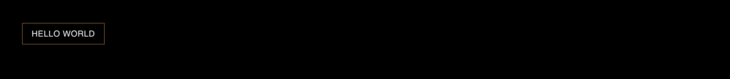
上記のようにファイルを修正しhttp://localhost:3000/にアクセスします。
下記のように表示されれば成功です。

リセットCSSの設定
import '@/styles/globals.css'
import type { AppProps } from 'next/app'
+ import { CssBaseline } from "@mui/material";

export default function App({ Component, pageProps }: AppProps) {
-  return <Component {...pageProps} />
+  return (
+    <>
+      <CssBaseline />
+      <Component {...pageProps} />
+    </>
+  )
}
これにてリセットCSSが導入されました。
グローバルCSSの設定
ルート直下に「plugins」というフォルダを作成しその中に、「mui.ts」を作成します。
以下のようにファイルに記載してください。
import { orange } from '@mui/material/colors';
import { createTheme } from '@mui/material/styles';

const theme = createTheme({
    palette: {
        // primaryの色を設定
        primary: {
            main: orange[300],
        },
    },
    components: {
        // ボタンのデザインを設定
        MuiButton: {
            styleOverrides: {
                outlinedPrimary: {
                    color: 'white',
                    borderRadius: 0,
                },
            },
        },
    },
});

export default theme;
ボタンのデザインやカラーをグローバルに設定しました。
以下のファイルを修正してください。
import '@/styles/globals.css'
import type { AppProps } from 'next/app'
import { CssBaseline } from "@mui/material";
+ import { ThemeProvider } from "@mui/material";
+ import theme from "../plugins/mui"

export default function App({ Component, pageProps }: AppProps) {
  return (
-    <>
+    <ThemeProvider theme={theme}>
      <CssBaseline />
      <Component {...pageProps} />
-    </>
+    </ThemeProvider>
  )
}
これでグローバルにCSSが設定されたはずです。
http://localhost:3000/にアクセスします。
デザインが適用されていれば成功です。
あわせて読みたい

ReactでマテリアルUIの環境構築
【はじめに】 今回はReactでマテリアルUIの環境構築をする手順について説明します。基本公式通りです。 https://mui.com/ 【実装】 create-react-appでプロジェクトを作...

